Redesigning how people find public health information
Discovery, information architecture and iterative design for a public-health website serving citizens and professionals across Wales.
The challenge
Public Health Wales wanted its web estate to become the main source of trusted public-health information in Wales. Instead, people faced too much complex content, inconsistent navigation and weak search. Citizens often recognised the NHS but not Public Health Wales, while professional users depended on prior knowledge or internal contacts to find material.
What I did
- Discovery: Led workshops and interviews with internal stakeholders, citizens, academics and employers, then combined the qualitative evidence with the survey findings. The same problems kept appearing: too much complex content, inconsistent navigation, low recognition of PHW, services arranged around the organisation and no consistent way to manage the web estate.
- User needs: Turned the evidence into five priorities: clear bilingual content, fast access to relevant information, navigation that works for different audiences, better search and clear signposting to the right source.
- Information architecture: Mapped representative journeys and designed a polyhierarchical structure. People could browse by content type or use an A to Z to reach the same subject, rather than being forced through the organisation's internal structure.
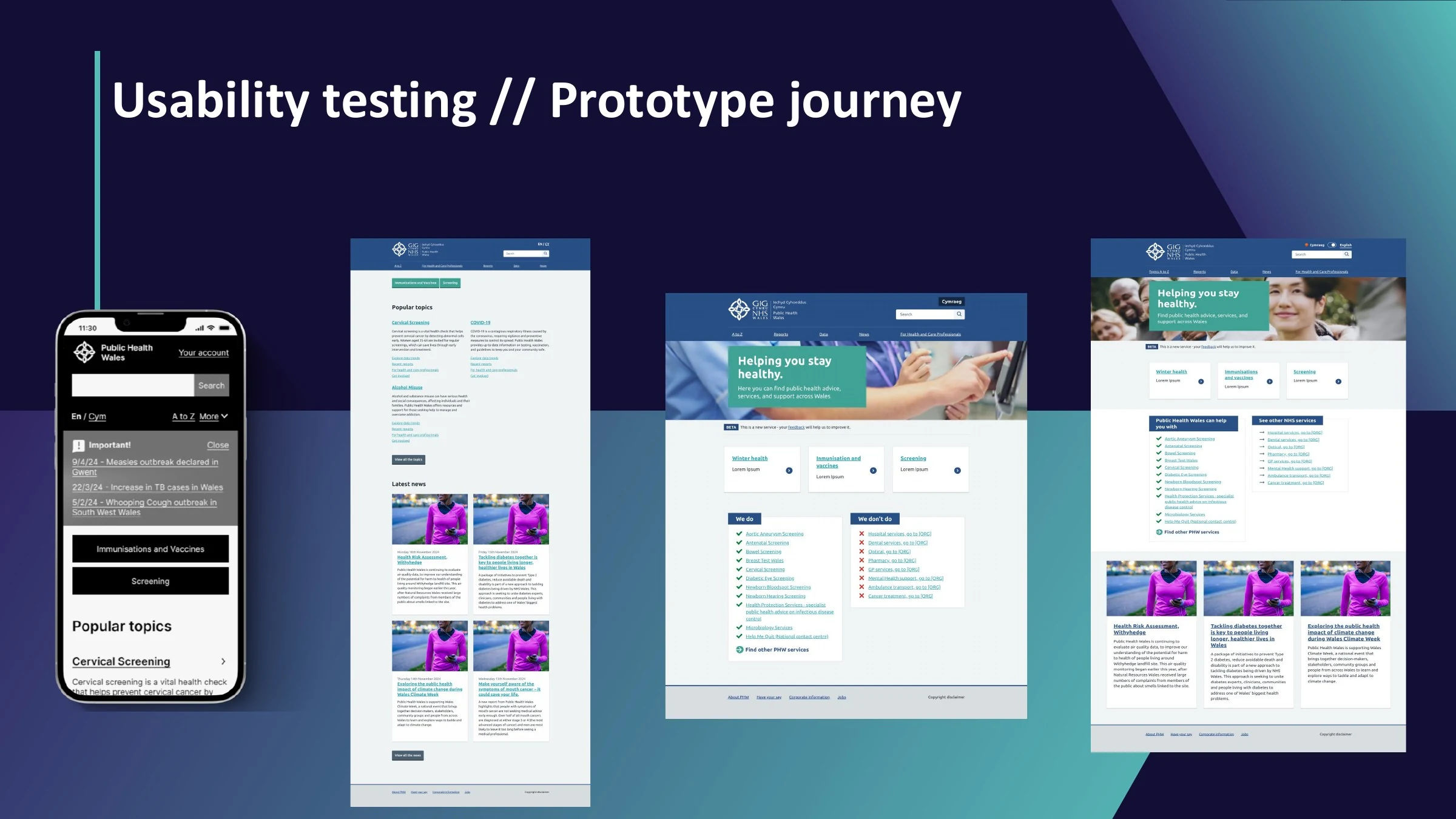
- Alpha design: Used card sorting, tree testing and moderated research to refine labels and routes. Built four prototype versions, simplified the A to Z, renamed Publications as Reports, added descriptions and removed homepage shortcuts that people found confusing.
- Beta research and design: Ran three rounds of online and in-person usability testing with 60 people across citizens, health and care professionals, employers, data users and PHW staff. Refined the desktop and mobile designs after each round, including the Welsh-language control, audience signposting, news, imagery and the explanation of what PHW does.
- Design principles: Turned the beta evidence into four principles for delivery: improve accessibility, support different routes and audiences, keep content current and make the service feel human. The report also set out the research still needed after beta, including work with people who have access needs and A/B testing.
What I took from it
This was not just a menu problem. One website had to work for people looking for simple health advice and specialists looking for data, while the content reflected a complicated organisation behind it. Giving people more than one route to the same information worked better than forcing every audience through one perfect hierarchy.
“I don't usually like the internet, but I do like this.”
Beta usability participant
Selected working artefacts
Selected pages from the final Discovery, Alpha and Beta reports. They show the problem evidence, the structure that followed and how the design changed through research.


